
GMI Visual Language Audit
An analysis of the FreeStyle Libre CGM smartphone app for its user interface led to an investigation of the GMI metric and its implications for how new clinical metrics may benefit from a corresponding visual language system.
Background
-
Continuous Glucose Monitoring (CGM) is a wearable technology that tracks blood sugar levels 24/7 using a sensor that has a small needle placed just under the skin. The sensor connects to a smartphone app or a recorder that displays sugar levels over time and can be used to track trends and manage diet and medication.
Freestyle Libre 3 product insert.
-
The FreeStyle Libre 3 is a CGM developed by Abbott.
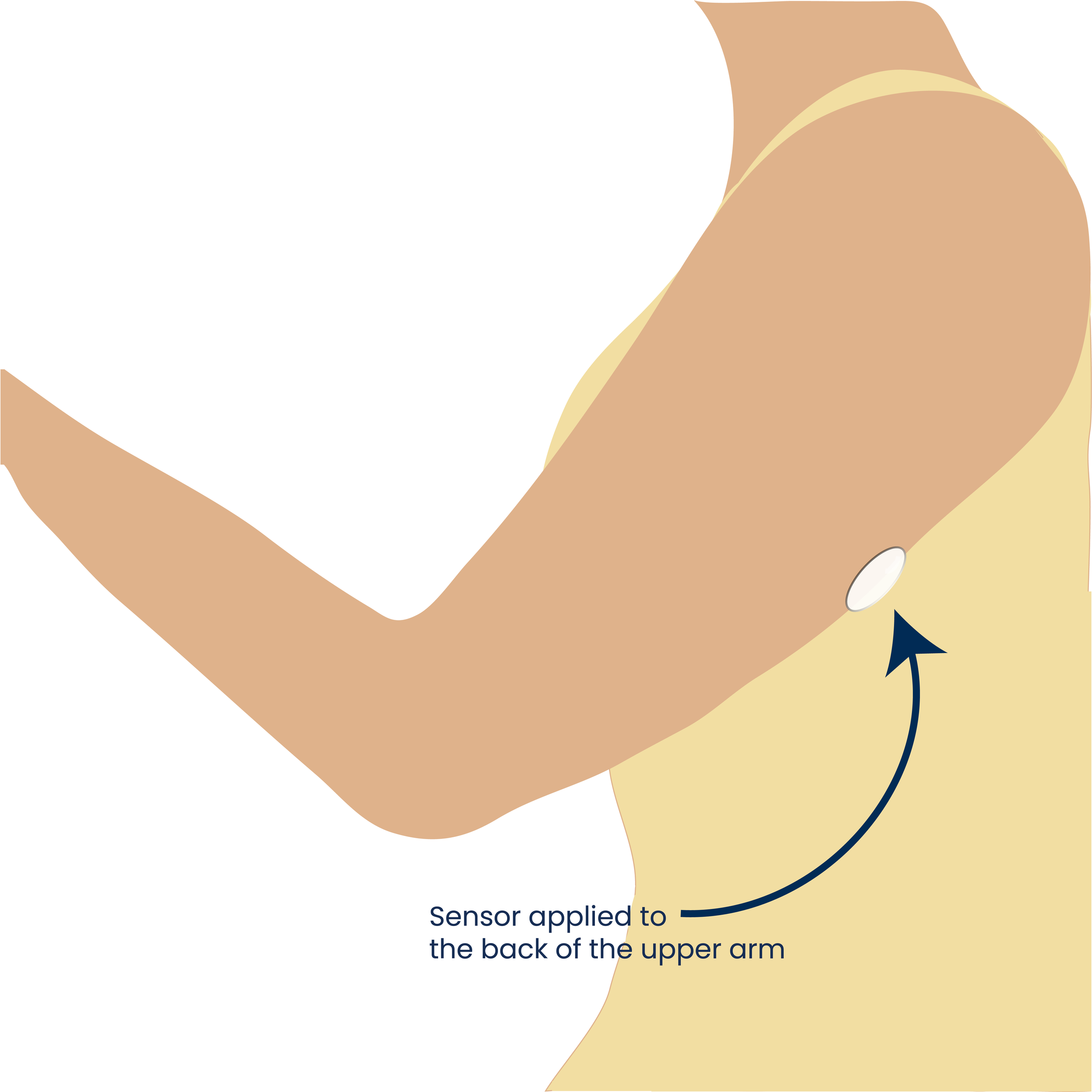
It comes with an applicator pre-loaded with the sensor, and a product insert that includes product indications for use along with written instructions and illustrations on how to apply the sensor to the back of the upper arm. The applicator is one-time use and works with a push mechanism.
The user can connect the sensor to a recorder or a smartphone app.
-
60+ y/o male with diabetes (has been managing condition for several years)
New to CGM (<1 year)
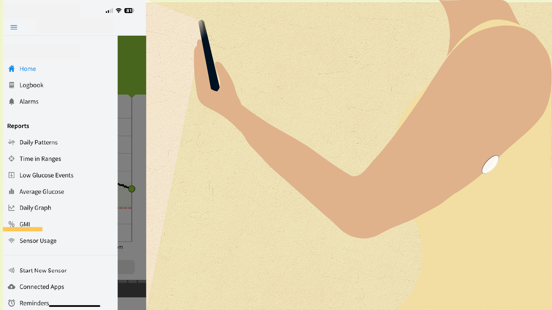
Focus of the interview was on his experience using the instructions (product insert- click to enlarge image) provided with Freestyle Libre CGM, as well as his overall experience with this device and other CGMs he has tried. He preferred to use the smartphone app over the recorder.
Screenshot of the FreeStyle Libre 3 App highlighting the GMI metric and GMI report screen.
Insights from FreeStyle Libre 3 App Review
There were some inconsistencies in visual language and areas for improvement throughout the app. The most intriguing finding was about a relatively new clinical metric called GMI.
-
Glucose Management Indicator (GMI) is an A1C-like value based on CGM-derived average glucose levels over a span of 14+ days.
-
The user did not actively use or consider using GMI. He did not know how to interpret and use it. He also did not have any focused discussion with his provider around GMI.
-
GMI was initially called eA1C or estimated A1C, but in reality, GMI does not always closely match the lab-measured A1C value, which was creating confusion for patients and providers who observed discrepancies between the two.
As a result, an adjusted calculation and label, GMI, were introduced. The goal was to help both patients and providers understand glucose trends to make therapeutic adjustments over a shorter time frame than is usually required for A1c (source).
GMI is unique among clinical metrics: it was built for patients, not just providers, and lives inside the app they already use every day. Yet no cohesive visual language exists to help patients actually understand and adopt GMI.
This gap reveals a broader problem. When new clinical metrics are introduced, new numbers follow but without guidelines for meaning. As healthcare becomes increasingly digital and patient-facing, visual communication systems will be essential for translating complex data into actionable understanding.
Just like a brand launch kit in graphic design (a full system of icons, color, typography, and usage guidelines), I propose building something equivalent for clinical metrics: a framework that elevates a number into a decision-making tool.
Design Opportunity
A cohesive visual system for GMI can include an infographic explaining the metric, better data visualization beyond just a number, and consistent colors and icons that provide repeated visual cues to reinforce the same visual language wherever the metric appears.
Designing Elements of a Visual System for GMI
Icon Design
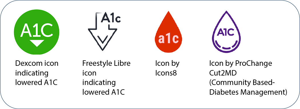
Because of its relation to A1C, it’s reasonable to draw inspiration for GMI icon design from A1C. There is no universally standardized icon to represent A1C. Some organizations just use a text label, others use a version of a droplet with a text label, or a circle with the text.
The GMI icon could be designed to intentionally stand out against the rest of the icons in the app menu because it is a separately defined term and calculation. In my designs, I chose to mimic common A1C icons, but with key differences.
For the circular icon, I did not include a down arrow, but instead included three tabs indicating a time range. For the teardrop icons, there are two versions - one with an asterisk superscript and one with a tilde superscript.
Each one represents the association with A1C. Given the complexity of the measurement, and that GMI does not directly correspond to A1C, an asterisk can indicate a special note, calling attention to the user, while a tilde represents approximation. If the icon is used in a different context without a label, the text “GMI” may be written inside the icon.
Improvements to GMI Data Visualization
The current GMI report page shows a standalone number with no context. Two simple changes could make it more useful: color-coding the value based on clinical range, and incorporating the Time in Ranges chart that already exists in the app, so the patient sees the full picture in one place. Time in Ranges is often used along with GMI to understand the nature of the change in glucose (whether it is stable or not).
After reading various sources online on the utility of GMI, I felt that there were too many opinions [source] for me to create a cohesive infographic on how to use this metric. I need further input from providers and patients alike in the diabetic management community to create an accurate communication material.